Bentley Styleguide

Website design system

Colours

Based on the digital colour palette of the Bentley brand guidelines.

Brand Colours

Other Colours

Implementing Colours

In the FE we we utilise sass variables to make our colours more reusable and maintainable. The format we follow is that we have a main palette where we use functions to get the colour we need. Example:


// _settings.colours.scss
$s-palette: (
  black: #000,
  offBlack: #333,
);

$s-colours: (
  global: (
    body-copy: getColourDirect(offBlack) // mixin lives in _settins.colours.scss
  )
);

// _generic.main-styles.scss
body {
  color: getColour(global, body-copy);
}

Following this standard allows us to scale our colour system with ease. If we change offBlack variable in $s-palette it will then update in all the components however if you change just the component colour it will only update in that one place.

Typography

Utilising the Bespoke Bentley typeface. Typography can appear in black, white & grey.

Font Family

Aa Bentley Font Semibold
Font Weight: 600

Aa Bentley Font Light
Font Weight: 400

Font Styles

Hero Heading Bentley Font Semibold
Font Weight: 600
Use on: Heros & Banners

Heading one Bentley Font Semibold
Font Weight: 600
Use on: Titles

Heading two Bentley Font Semibold
Font Weight: 600

Heading three Bentley Font Semibold
Font Weight: 600

Heading four Bentley Font Light
Font Weight: 400

Heading five Bentley Font Light
Font Weight: 400

Body copy medium Bentley Font Light
Font Weight: 600
Use on: body text

Body Large Bentley Font Light
Font Weight: 600
Use on: when text needs to be enlarge

Body Small Bentley Font Light
Font Weight: 600

Button text Bentley Font Semibold
Font Weight: 600
Use on: CTA's

Pretitle hero Bentley Font Light
Font Weight: 600
Use on: Heros & Banners

Pretitle Bentley Font Light
Font Weight: 600
Use on: Blog headings

Product Card Heading Bentley Font Light
Font Weight: 600
Use on: Product cards

Product Card Price Bentley Font Light
Font Weight: 400
Use on: product cards

Accordion Title Bentley Font Semibold
Font Weight: 600
Use on: product detail component

Breadcrumb Bentley Font light
Font Weight: 400
Use on: Breadcrumb

Implementing a font style

All of the font styles live inside a sass map call $font-styles. Like colours, we have generic font styles and then if we need to make a component specific font style we will add a new font style type in the font map. Note: if you add a new one please update the styleguide. An example of implementing this would be:


// _component.scss
.component__title {
  @include getFontStyle(h1);
}

We implement font styles by a mixn due to performance reasons. Due to the CSS now having repeatitive pieces of code GZIP loves that sort of stuff so it makes the CSS smaller in file size than it would if you was to use extends or a single class. Another benefit will be that it decouples the styling from a single class and gives the styles just to the component.
Buttons

Buttons show the user's choice of options for actions and assign these to a clear hierarchy.

Button Sizes

Medium Button

Large Button

For maximum legibility text should remain on a single line
Side padding on all buttons 16px
minimum width 220px
Suggested 30 character length maximum.

HTML:


<p>Medium Button</p>
<button type="button" class="button">Add to basket</button>

<p>Large Button</p>
<button type="button" class="button button--large">Add to basket</button>

Primary Buttons

Font Size 16px
Bentley semi-bold all caps
Static, active & disabled - use for key journey actions

HTML:


<button type="button" class="button">Add to basket</button>
<button type="button" class="button" disabled>Add to basket</button>

Secondary Buttons

Font Size 16px
Bentley semi-bold all caps
Static, disabled - use for secondary links

HTML:


<button type="button" class="button button--secondary">Add to basket</button>
<button type="button" class="button button--secondary" disabled>Add to basket</button>

Secondary Alt Buttons

Font Size 16px
Bentley semi-bold all caps
Static, disabled - use for banner images


<button type="button" class="button button--transparent-black">Add to basket</button>
<button type="button" class="button button--transparent-black" disabled>Add to basket</button>

Grid

The fluid grid is 12 column.

Desktop: 40px margin, 24px gutter

Tablet: 20px margin, 16px gutter

Mobile: 15px margin 10px gutter

Grid

We use flex to style our grid due to browser support. Like Bootstrap, we use responsive class names to style the layout. Example; we want to have a grid section that is 3x3 on desktop 2-1-2-1-2-1 on tablet and 1-1-1-1-1-1 on mobile.

Implementation

To do this, the code would have to look like the following:


<div class="my-component grid">
  <div class="grid-item grid-item--xs-12 grid-item--md-6 grid-item--lg-4"></div>
  <div class="grid-item grid-item--xs-12 grid-item--md-6 grid-item--lg-4"></div>
  <div class="grid-item grid-item--xs-12 grid-item--lg-4"></div>
  <div class="grid-item grid-item--xs-12 grid-item--md-6 grid-item--lg-4"></div>
  <div class="grid-item grid-item--xs-12 grid-item--md-6 grid-item--lg-4"></div>
  <div class="grid-item grid-item--xs-12 grid-item--lg-4"></div>
  <div class="grid-item grid-item--xs-12 grid-item--md-6 grid-item--lg-4"></div>
  <div class="grid-item grid-item--xs-12 grid-item--md-6 grid-item--lg-4"></div>
  <div class="grid-item grid-item--xs-12 grid-item--lg-4"></div>
</div>

What is nice about this approach is that it removes the need to keep adding layout styles to new components. It is all consisitent and the gutters are all the same per component.

Breakpoints

xs sm md lg super
> 0px > 460px > 768px > 1024px > 1200px

Images

Aspect ratios for images are defined here and how to implement images within the shopify template.

Uploading images

All imagery should be of high quality, visually engaging and promote the luxury of the Bentley brand. Each component will have their own image size which will be further down the page.

Shopify CDN

Alot of images that come from shopify CDN will have a aspect_ratio property on the object. If the aspect ratio of the image needs to change for different breakpoints you can still get access to the width & height property. More information on the image object from shopify. Implementing an aspect ratio from the server is really easy. What you have to do in the liquid file is:


// snippets/picture.liquid
<style>
  // with width & height
  .my-component__picture {
    padding-top: calc(/* image.width / image.height */ * 100%); // syntax is  not /**/
  }


  // using the aspect ratio method
  .my-component__picture {
    padding-top: /* image.aspect_ratio */; // syntax is  not /**/
  }
</style>
<picture class="my-component__picture"></picture>

Creating a CDN string

Creating an image string in the liquid template is very simple. First you reference the image object and then pass in parameters for what you want the imafe to be. Example:


// snippets/picture.liquid
/* article.image | img_url: '1900x550', crop: 'center', format: 'pjpg' */ // syntax is meant to be 

Parameters

img_url Set the width & height of the image.
crop What angle of crop you want to have. Example: 'center', 'right', 'top'
format The file format of the image. Options are jpg, png, pjpg. pjpg is recommended due to preceieved performance reasons.

Icons

You have 0 of items in your basket
icon-email-o

Components

Bomber For Bentley

Bomber For Bentley

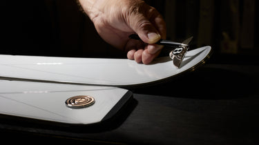
Bentley’s partnership with artisan ski equipment maker Bomber Ski continues to develop. Beginning in 2019 with the introduction of limited-edition skis, it has grown to encompass new ski designs for 2022, alongside helmets and poles created to complete your winter look.

Expertly engineered and effortlessly beautiful, Bomber for Bentley... Read More about Bomber For Bentley

Recent Posts

Bomber For Bentley

Bomber For Bentley

Bentley’s partnership with artisan ski equipment maker Bomber Ski continues to develop. Beginning in 2019 with the introduction of limited-edition ... Read More about Bomber For Bentley
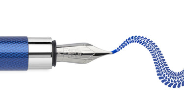
Graf von Faber-Castell

Graf von Faber-Castell

A passion for unrivalled craftsmanship and unmistakable design unites Bentley and fine writing instrument manufacturer Graf von Faber-Castell. A co... Read More about Graf von Faber-Castell
Bentley Fragrances

Bentley Fragrances

The Bentley Fragrance collection draws on a prestigious world of rare natural ingredients to create remarkable fragrances. Developed with the fines... Read More about Bentley Fragrances